With the update of the TYPO3 system, not only was the system software updated, but some elements in the website view were also changed.
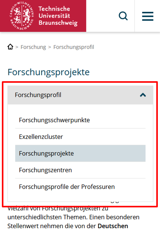
The most noticeable change is an adjustment to the breadcrumb navigation. This has now been optimised and shortened so that it no longer takes up so much space, but still retains its function as a navigation element for parent pages. As part of the changeover, the very long first element of the breadcrump navigation "TU Braunschweig", which always leads back to the homepage of the website, has been replaced by a small, slim house icon, which saves a lot of space in the display. The other elements of the breadcrumb navigation have also been shortened. For example, the page you are on is no longer displayed in the navigation.
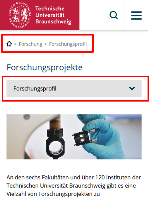
In the mobile view of the website, there is an innovation in the display of the sub-navigation. This is now displayed more prominently like a drop-down menu and is also positioned differently. This should help to ensure that the sub-navigation is actually perceived as a sub-navigation in the mobile view, which was not always the case in the past, as users have reported to us. Please give us feedback on whether the new display is now more eye-catching and more recognisable as navigation.
In addition to these major changes, there have also been other small adjustments that are not so noticeable, such as changes to button placements, adjustments to spacing or optimisations to the font size in the mobile view. For example, long titles should no longer run out of the image in the mobile view.